Tips for Better Portrait Photography
Aperture of f/8-f/16
If you’re not familiar with aperture, allow me to briefly sum it up for you. The wider the aperture, the lower the f-number, and the shallower the depth of field. The opposite is true for narrow apertures. It’s widely agreed that around 2-4 stops wider than your narrowest aperture (f/22) is where your lens will be at its sharpest. That’s why we often use f/8-f/16 when taking portraits. It’s very sharp, and the depth of field is deep enough to keep the whole face in focus, but not so deep that there’s no blur at all in the background. You want a slight blur to help separate the background from the subject. It’s common practice to shoot in manual or aperture priority mode because you can easily select the aperture which best suits your photo.
Eye Direction
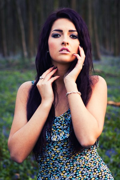
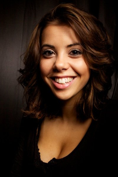
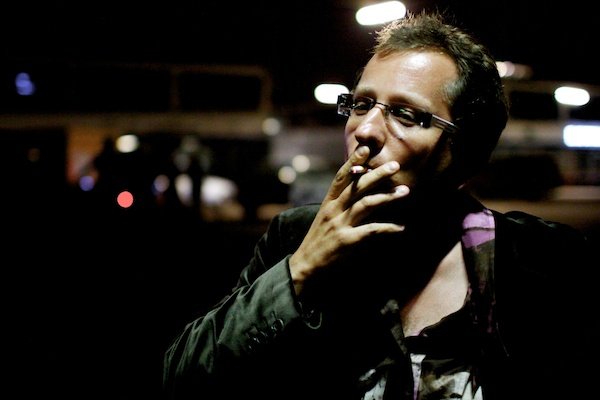
There are two rules that I like to follow here. You either look straight into the camera, or your eyes follow the direction of your nose. Anything in between has no place in portraiture, in my opinion. When you look away in some ambiguous direction, you give the photo an ambiguous feel, like there’s something more than the viewer should be looking for, when in reality, there’s not. Keep it simple. We will try to follow eye-lines when we see them, so it’s best that we’re not sent off in the wrong direction. Keep the attention on the subject. [For even more useful tips on portraiture and setting up for portrait photography, check out out our Complete Guide to Portrait Photography —Ed.]
Use a Longer Focal Length- 70-135mm
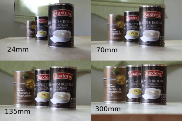
Using a longer focal length isn’t some sort of magic trick that makes your subject look better, it’s all about your distance from a subject. If you have a look at the photo below, you’ll see that the longer the focal length, the further away I have to move, and the more compressed the image looks. This compression is flattering for your subject because it appears to compress facial features slightly and make us look thinner. And that never hurts. Have a look at the photos below, it was taken at 105mm. An 85mm Prime lens is a great choice for portrait photography.
Black & White is Timeless
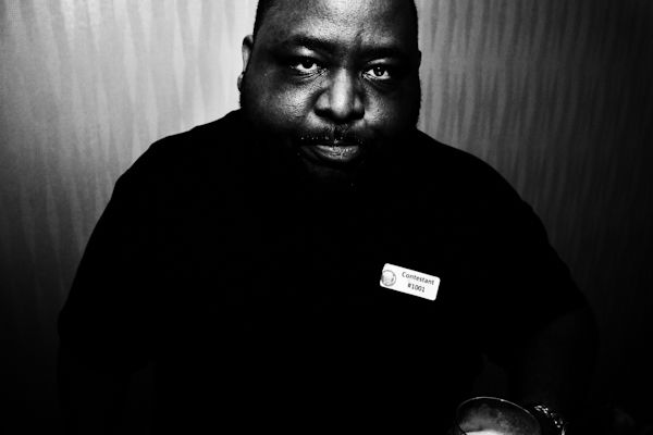
There’s just something about black and white portraiture. The texture really stands out when you’re shooting in black and white, and it’s in these small details of texture that you find the character of a person’s face. It also removes any distracting colors and strips the focus back to the person, rather than anything else that may be appearing in the scene. Some of the most inspiring portraits in the world are in black and white, whether that’s down to technological restrictions (initially at least) in the case of Irving Penn, or choice, in the case of Henri Cartier-Bresson.
Off-Camera Lighting is Essential
This is a very important rule because the lighting is half the battle when it comes to taking portraits. When you have a light source coming from the same angle as the camera, you completely flatten the image, because there are no shadows left. When you move the light source to just slightly away from the camera, it immediately adds depth. If you can use off-camera lighting, preferably with a beauty dish or softbox, then that’s great, but if you don’t have this at your disposal, then not to worry. I often use window light, as it acts like a lot like a lightbox (in fact, this is what studios used to use back in the day), and you can simply move your subject, rather than trying to manipulate the light.
Have Your Model Towards The Camera
The camera adds ten pounds. It’s your job as the photographer to try to remove them again. You can be the best photographer in the world, and have the best lighting, but if you can’t direct your models correctly, you’re still going to have weak photos. When we stand straight into a camera, we’re at our widest, and we produce a block in the photo. If the photo is of our head and shoulders, then we’re now the full width of the image. Not good. Conversely, when a model turns into the camera, ideally with the shoulders at slightly different heights, they seems to shrink in the frame slightly, and this is great for making them look both skinnier and more interesting.
Avoid Bright Clothing
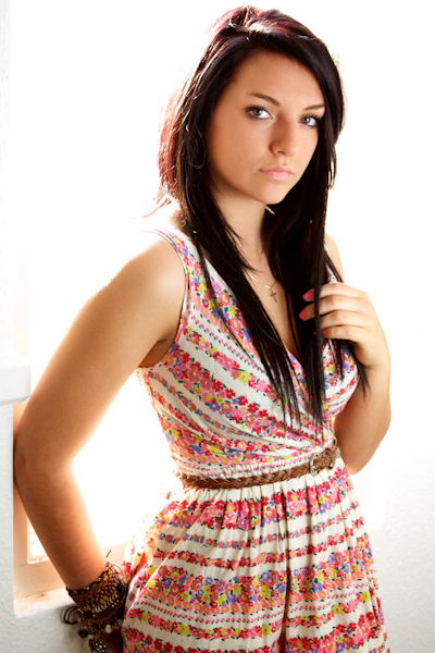
Remember, a portrait is about the subject, not the clothes they’re wearing. When the subject is wearing really bright and colorful clothing, it’s going to be distracting for the viewer, who is going to be automatically drawn to it. This is often overlooked because it’s down to the subject/client, rather than the photographer, but you need to pay close attention to what they’re wearing if you want to get the best results. Obviously, if you’re taking fashion photos, this rule goes out of the window.
Watch that Chin!
No one likes to see their double chin in a photo, and it’s actually not that hard to make sure that your subject isn’t flashing theirs. It’s all about the jaw. That’s a link to a video from Peter Hurley, who knows what he’s talking about when it comes to portraits. Peter sums it up really nicely. It’s pretty simple really, you want to make sure that your subject brings their head forward slightly, and then tilts their jaw down and out. Simple, double chin removal process complete. Well, as much as possible at least. And don’t worry about it feeling unnatural, as I’m sure you’re all sitting at your computers craning your necks. Remember what I said about compressing images by using longer focal lengths. You won’t notice the neck.
Remove Background Clutter
There’s a reason that portraits are often taken on a very boring background. It can be from a white screen to a textured wall, and anything in between. Just so long as it’s fairly uniform and not distracting. Because distracting is the key word here. Just like bright clothing, you don’t want to distract the viewer away from the subject. So although you may be tempted to take a portrait against the backdrop of a sunset, that doesn’t really have a place in portrait photography, that’s more of an extension of landscape photography. Portraits focus on the person. Keep it simple.
Pay Attention to the Nose/Cheek Line
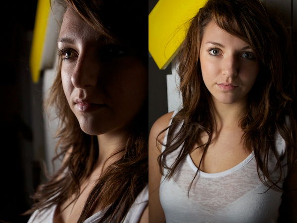
If you haven’t noticed this before, I can guarantee that after reading this, it will start to stand out like a sore thumb to you. When we take portraits, we usually take them head-on, right? With maybe a slight turn to one side. Well, as we turn our heads slightly the nose goes with it. The nose/cheek line I’m referring to is when the nose points out past the cheek. This makes it stand out and look large. It also ruins the flow of the face, in my opinion. Have a look at my comparison below.

